Epidemiology is a serious subject and one I'm not really an expert in. So while this is a fun experiment don't treat it as a serious public health thingy.
I was playing the board game Twilight Imperium and came across an interesting scenario for analysis and modelling infections. It's complex board game, with a large hexagonal map:

The map is made up of differing systems, each represented by a hexagon, which may contain planets. Different systems have differing planets, some with up to 3, some with none. One of the game's central mechanics is occupying and controlling these systems by placing "infantry" on them, representing populationsThere are no civilian populations in the game, just military . As the game progresses, players spread out from home systems, pushing through unocupied planets, eventually colliding into skirmishes and forming frontlines.
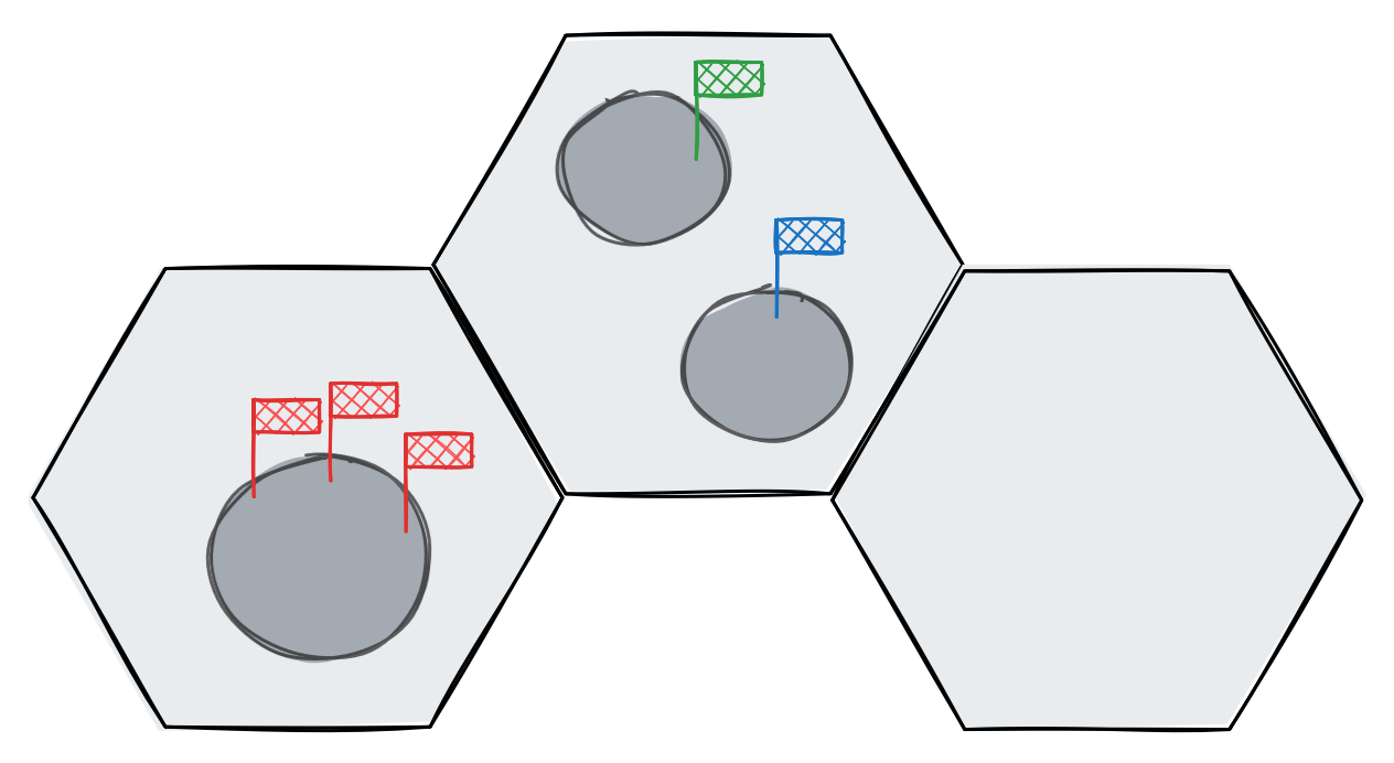
Systems from left to right, 3 Red infantry, 1 Blue and 1 Green infantry, no infantry
In a recent game a particular action card came up, Locust:

The idea is to unleash a targeted plague on the galaxy, aimed at your opponents systems. But it depends partially on chance, the roll of a dice, to determine its spread. So in some ways, this might behave like a real infection. I thought it would be fun to treat this as an experiment in statistical modelling, and see if we can predict the spread of the plague.
Now if you think about it, this is not a disease, and adheres to the card's name: it simulates a single "plague" of locusts moving on its own path, destroying things in it's path. by contrast, diseases spread in all directions, multiplying and re-infecting, leading to much greater infection:
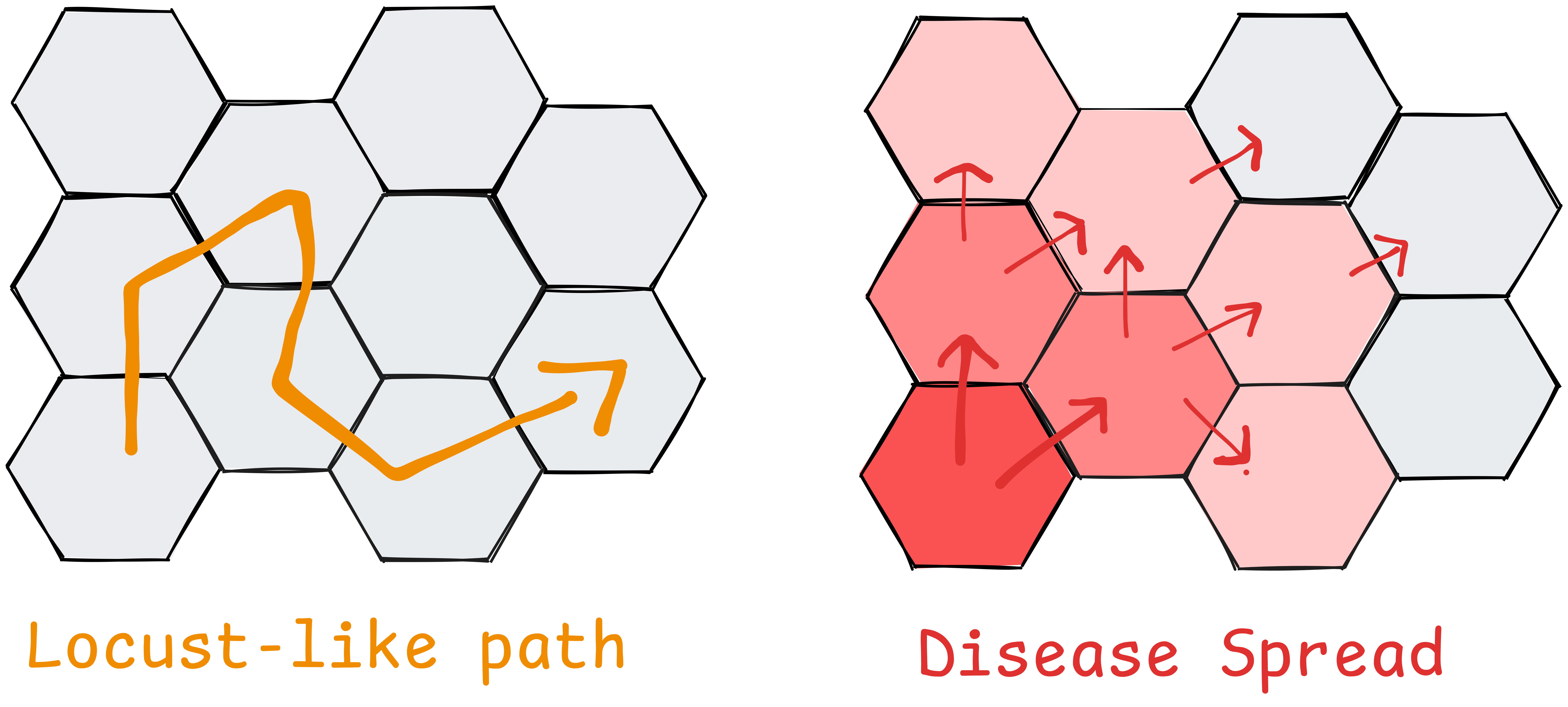
Nonetheless, in this scenario the locusts spread through connected populations and therefore behave somewhat like a communicable disease, so we're going to continue using terminology "epidemic", "infection", etc.
Real epidemiology
In the real world analysis and depiction of diseases is a much more complex topic than in our example. In real life analysis has different purposes:there are probably official terms for these
- Retro-active analysis: looking backwards to ascertain truth, where an infection started, or what's causing it
- Trying to analyse behaviour of disease (how it's transmitted)
- Future facing analysis: trying to predict future infections and stop them
Retro-active analysis of an epidemic was the function of one of the most famous statistical illustration out there: John Snow's Cholera Map of London.
The original can be found here: Project Gutenberg - On the Mode of Communication of Cholera https://www.gutenberg.org/files/72894/72894-h/72894-h.htm
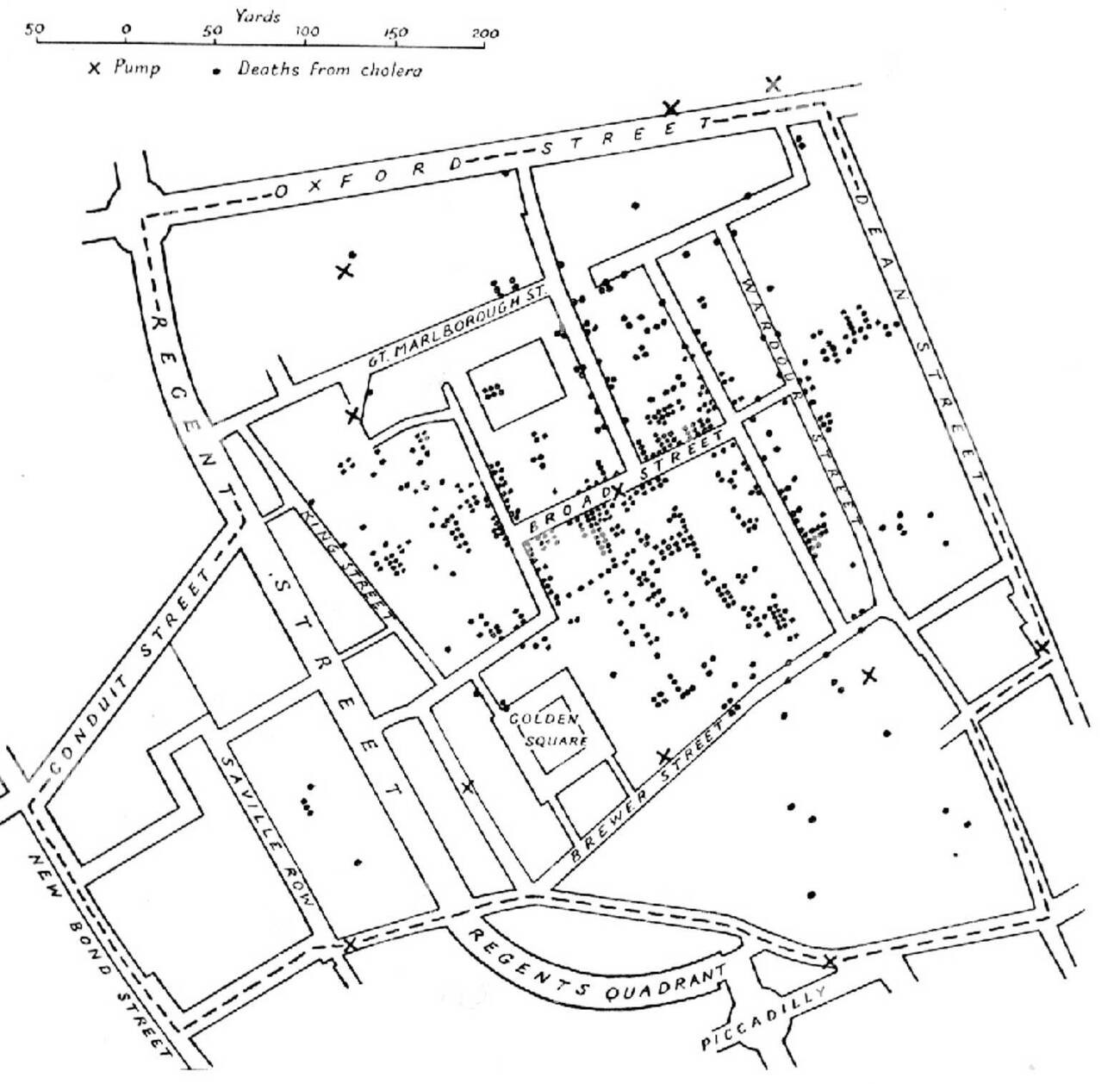
John Snow, A Geography of Life and Death
Snow recorded deaths in London during a cholera pandemic, shown here by dots, and when viewed on a map, their clustering identified the broad street pump as the source of infection. When the pump was closed, this reduced rates of infection in the areahttps://www.londonmuseum.org.uk/collections/london-stories/john-snow-cholera-broad-street-pump/ . This nicely showcases the power of effective illustration in communicating data, and is a nice prelude to our example.
Real epidemiology is further complicated by the fact that the data itself is uncertain. Estimates for "transmissibility" vary, and are often revised retroactively. Infections and casualties may be over or under diagnosed, mis-attributed, and take time to analyse. Different people and populations have different susceptibilities to diseases, depending on age, genetics, access to medicine, climate, population density, etc.
There's a great chapter discussing these complexities in "The Signal and the Noise"https://www.amazon.co.uk/Signal-Noise-Art-Science-Prediction/dp/0141975652 . This discusses challenges in predicting epidemics, and how prediction / reporting of a disease is itself a variable in their spread.
In the scenario we'll be looking at we have a well defined population, and a perfect definition of how the infection spreads which remains constant across every transmission, greatly simplifying our model.
Plan
Anyway, let's go back to the game scenario. We want to model and illustrate the possible outcomes of the infection, and to do this we need two input variables:
- Starting state: population of the map before the disease
- Spreading behaviour
Our output will be a map of expected casualties.
Model
In epidemiology, transmisibility of a disease is expressed as an 'R-number'https://en.wikipedia.org/wiki/Basic_reproduction_number . This represents the number of people infected by an existing infection, and determines the rate of spread of the disease. Obviously factors like immunity and variations affect the real numbers, but the nice thing about large populations is that they tend to obey statistical laws at a macro level.
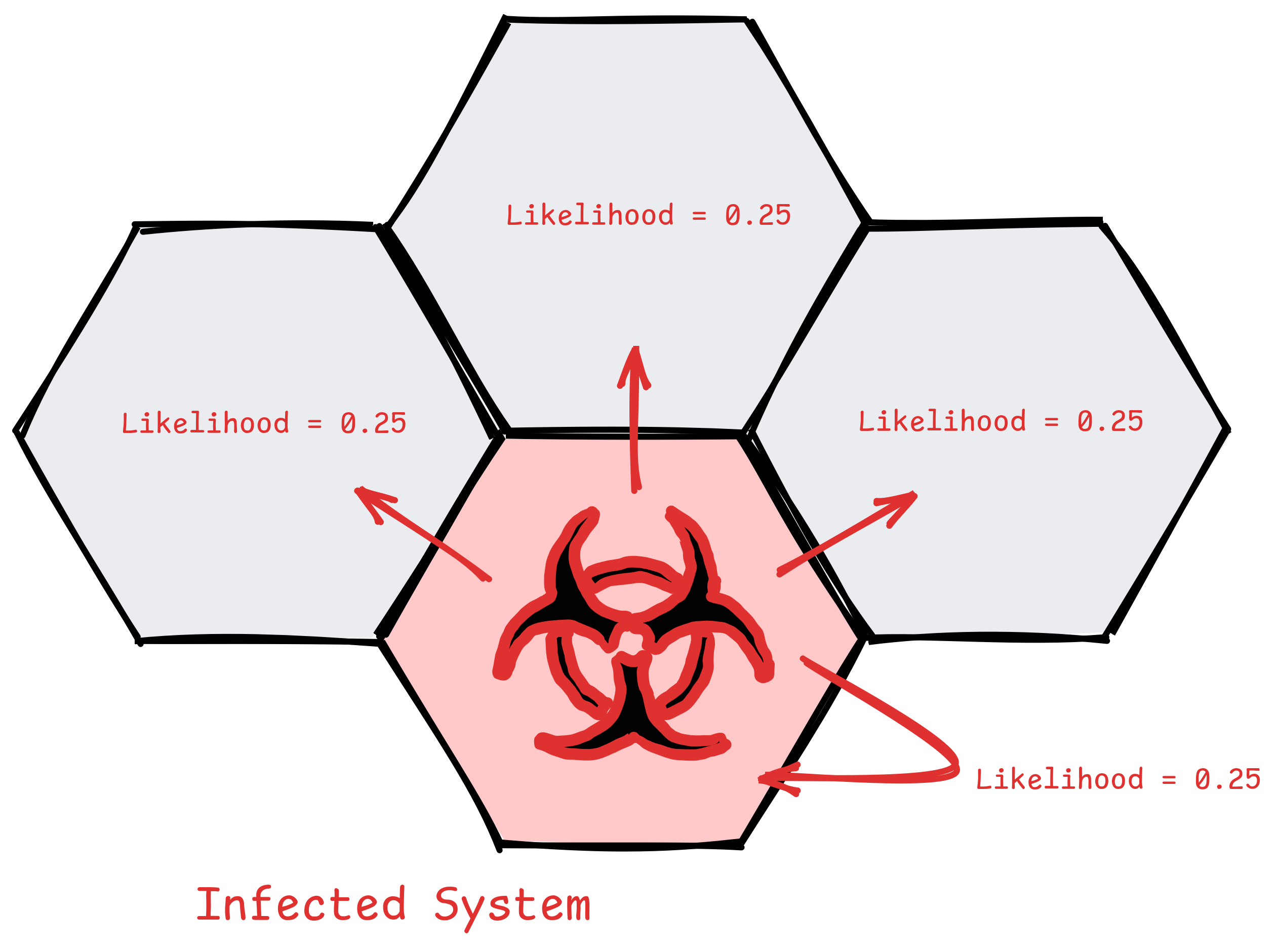
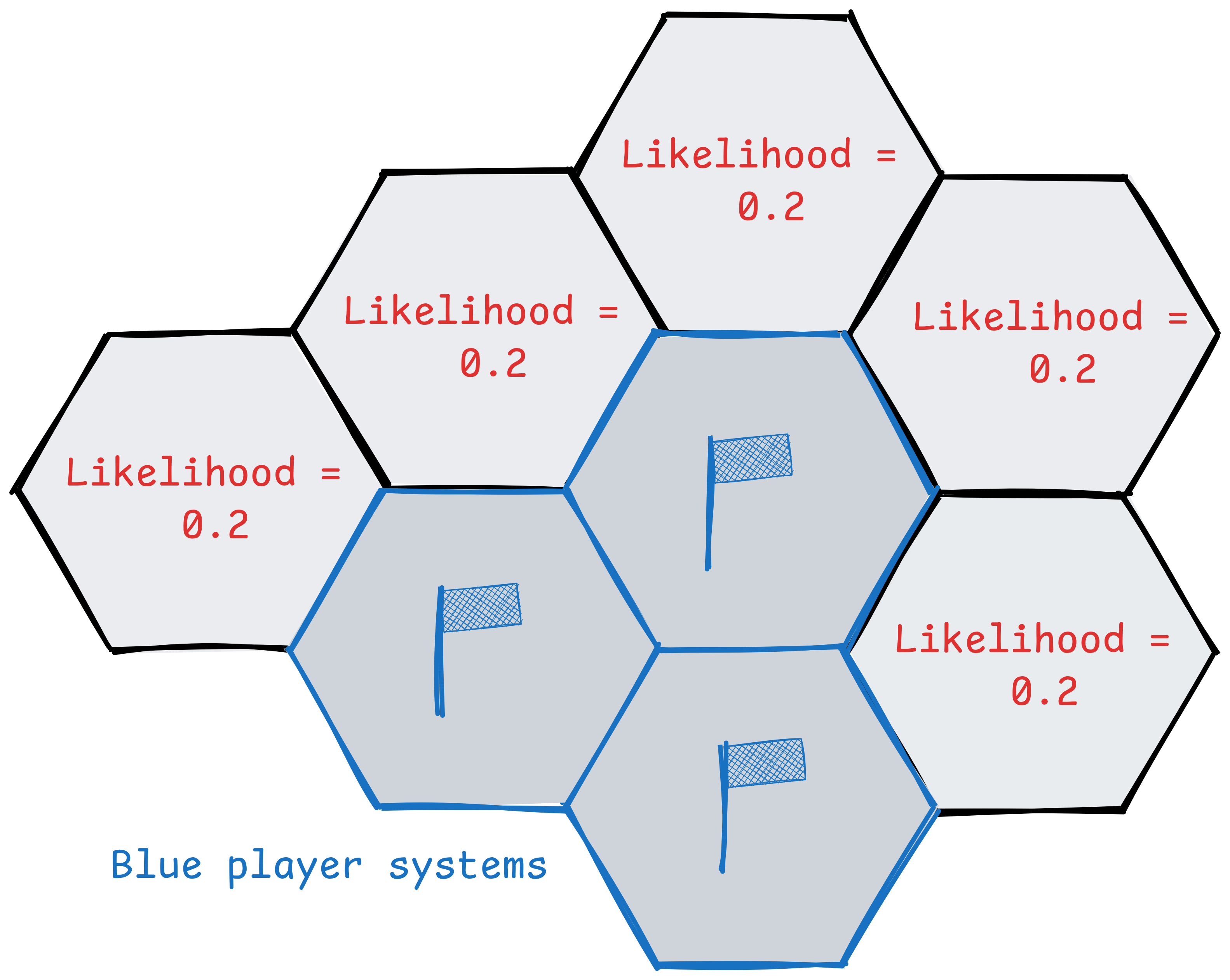
In our game the card says there is a constant chance of infection from one system to the next, and that the locusts can travel to "the same or adjacent" system, so systems can be re-infectedThe infection doesn't care about the number of planets, just systems and infantry. .
In reality the player playing the card has agency and can choose which system to target. They're likely to target it at systems with larger numbers of infantry, or protecting more strategic locations. We could attempt to model this by giving a greater likelihood to systems with higher populations, but then we're really just introducing more bias into the model.
So I'll go with the simplest possible model, where every adjacent system, plus the original system, has an equal likelihood of infection.
The chain of infections ends when it fails to infect, which is when the player rolls < 3. The game uses a 10 sided dice and 0's count as 10, so there is an 0.8 chance of the infection continuing, and 0.2 of it stopping.
            1 2 = Infection stops
3 4 5 6 7 8 9 0 = Infection continues

p = 0.2
q = 0.8
Each infection attempt is therefore a boolean variable, and we can model it's spread as a Geometric distribution with probability of infection (p) = 0.8, and the number of systems infected in the chain is k. This is because successes have to be successive. If we relate this to coin flipping, we are measuring the number of times you get heads in a row, not the number of heads you get when flipping a coin 10 times. That would be described by a Binomial Distribution.
We can see the expected spread in the table and graph below.
The final column of the table is probably what we're interested in, this is the appropriately named Survival function, P(X≥k)=p, and is equivalent to "what's the probability the infection gets to at least this number of infections before ending".
| k (successes) | calculation | P(X = k) | P(X ≥ k) |
|---|---|---|---|
| 0 | 0.2 | 0.2000 | 1.0000 |
| 1 | 0.8 × 0.2 | 0.1600 | 0.8000 |
| 2 | 0.8² × 0.2 | 0.1280 | 0.6400 |
| 3 | 0.8³ × 0.2 | 0.1024 | 0.5120 |
| 4 | 0.8⁴ × 0.2 | 0.0819 | 0.4096 |
| 5 | 0.8⁵ × 0.2 | 0.0655 | 0.3277 |
| 6 | 0.8⁶ × 0.2 | 0.0524 | 0.2621 |
| 7 | 0.8⁷ × 0.2 | 0.0419 | 0.2097 |
| 8 | 0.8⁸ × 0.2 | 0.0336 | 0.1678 |
| 9 | 0.8⁹ × 0.2 | 0.0268 | 0.1342 |
| 10 | 0.8¹⁰ × 0.2 | 0.0214 | 0.1074 |
import matplotlib.pyplot as plt
import numpy as np

p = 0.8
q = 1 - p
k = np.arange(0, 11)
probs = (p ** k) * q
survival = p ** k

fig, ax1 = plt.subplots(figsize=(10, 6))

ax1.set_ylim(0, 1)


fig.patch.set_facecolor('none')
ax1.patch.set_facecolor('none')


# bars for P(X = k)
bars = ax1.bar(k, probs, color='steelblue', edgecolor='black', alpha=0.7, label='P(X = k)')
ax1.set_xlabel('k (successes before failure)')
ax1.set_ylabel('P(X = k)', color='steelblue')
ax1.tick_params(axis='y', labelcolor='steelblue')
ax1.set_xticks(k)

for i, prob in enumerate(probs):
    ax1.text(i, prob + 0.002, f'{prob:.4f}', ha='center', va='bottom', fontsize=7, color='steelblue')

# survival function on second y axis
ax2 = ax1.twinx()
ax2.plot(k, survival, color='crimson', marker='o', linewidth=2, label='P(X ≥ k)')
ax2.set_ylabel('P(X ≥ k)', color='crimson')
ax2.tick_params(axis='y', labelcolor='crimson')
ax2.set_ylim(0, 1)
ax2.patch.set_facecolor('none')

for i, s in enumerate(survival):
    ax2.text(i, s + 0.01, f'{s:.4f}', ha='center', va='bottom', fontsize=7, color='crimson')

# combined legend
lines1, labels1 = ax1.get_legend_handles_labels()
lines2, labels2 = ax2.get_legend_handles_labels()
ax1.legend(lines1 + lines2, labels1 + labels2, loc='upper right')

plt.title(f'Geometric Distribution (p = {p})')
fig.tight_layout()

# save as html via mpld3
try:
    import mpld3
    html = mpld3.fig_to_html(fig)
    with open('geometric_distribution.html', 'w') as f:
        f.write(html)
    print('[+] saved to geometric_distribution.html')
except ImportError:
    print('[-] mpld3 not found, install with: pip install mpld3')
    print('[-] falling back to png')
    plt.savefig('geometric_distribution.png', dpi=150, transparent=True)

plt.show()
As we can see, the geometric distribution means it trails off. If the infection travels in a straight line from the centre, we can map it's expected reach as a heatmap.
But in reality the process is more involved. The infection can change direction, and not every system can be infected. Additionally
The system of actions is:
- System is infected
- 10 sided dice is rolled
- If result =< 2, the infection haltsremmeber 0 = 10 in this system
- If result >=3 an infantry is killed
- The infection moves to the same or adjacent system and repeats
This means, if a system has 1 infantry, and it's destroyed, it can't be re-infected. This makes the simulation more complex and means we probably can't be simulated with a simple geometric distribution.
Instead, the best way to model this will be a Monte-carlo simulation, in which we simulate potential outcomes and record the results.
To do this I'll build a model of the galaxy, simulate an infection until it peters out, reaching an eventual end-state with casualties. Then I'll run a number of simulations, and average the results, modelling expected outcomes and the average fatalities per system.
Building a model
All we need is an object for each system, with a population count (for each player), and list of adjacent systems.
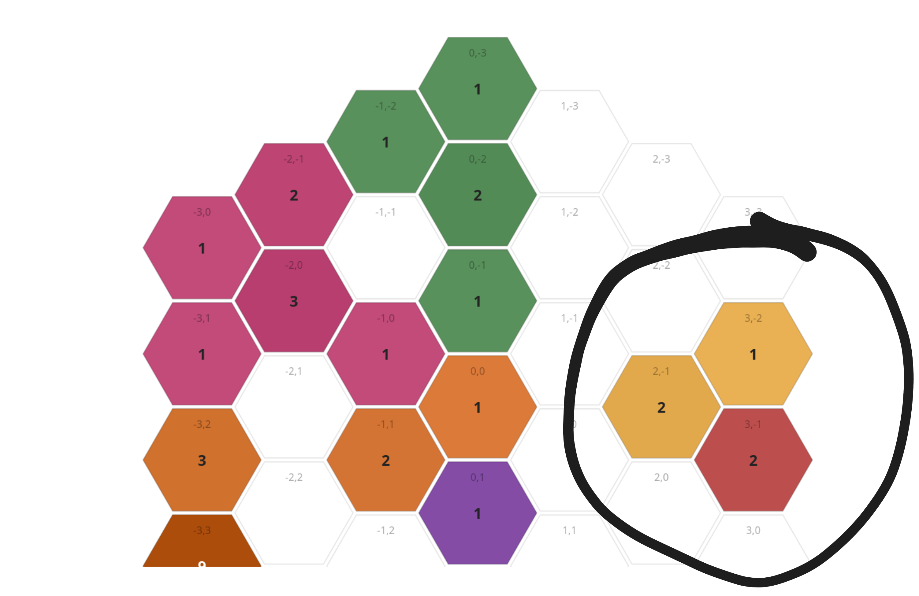
Then we configure the model with the number of infantry in each system. I did this from a snapshot of the game state, and a python script to parse the populations. Shown below, the populations turn out to be very sparse, significantly reducing the likelihood of a significant epidemic.
Start state
The originating player can choose any system adjacent to theirs in which to begin the infection. We could assume an equal likelihood amongst adjacent systems:
Or we could simulate from the point at which the player has chosen the first system to infect. This is the easiest option so is what we'll go with. The system chosen in the game was (-1,-1) on the above map, the tile with 2 orange population, below left of the centre.
Transmission
Now we model an infection. This is nice and simple based on the list of adjacent systems and their per-player populations. Our starting point will be
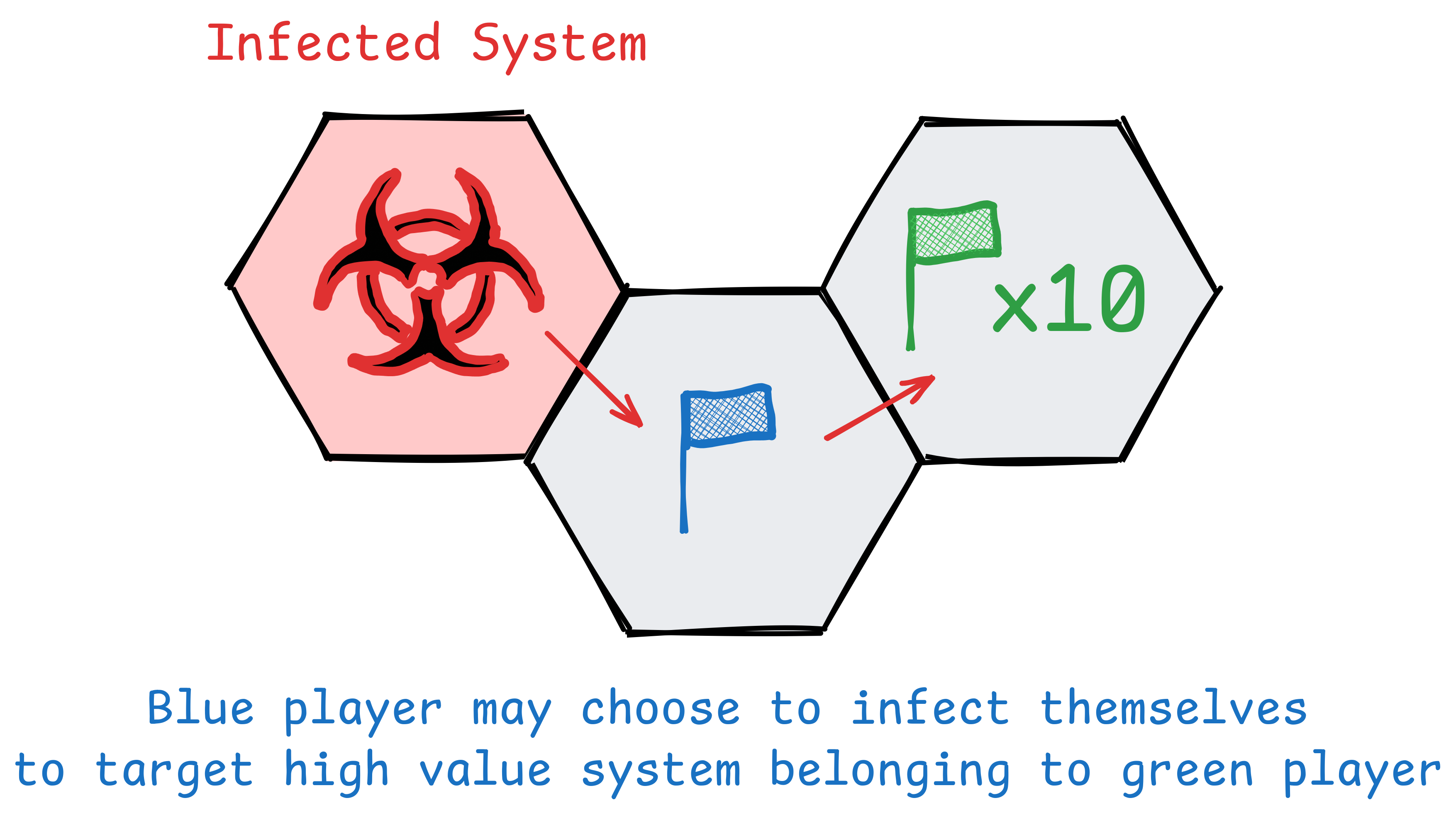
Technically, the player could deliberately target their own systems, and might if it provided a bridge to a particularly high value target
for _ in range(max_steps):
    roll = roll_d10()

    if roll <= 2:
        # infection halts
        break

    # roll >= 3: kill one unit in current system
    # pick a random player with population > 0
    mortal_players = [
        p for p in PLAYERS
        if p != IMMUNE_PLAYER and populations[current].get(p, 0) > 0
    ]

    victim = random.choice(mortal_players)
    populations[current][victim] -= 1
    casualties[current][victim] += 1

    # check if hex is now cleared
    if mortal_population(populations[current]) == 0:
        cleared.add(current)

    # find valid next systems
    candidates = infectable_candidates(current, populations, cleared)

    if not candidates:
        # nowhere left to spread - halt
        break

    current = random.choice(candidates)
You can find the complete script here: simulation.py
Results
So what happens when we run our simulation?
I set the number of experiments at 500 simulations. Here we can see the first 9, showing the variation. In 2 of them the infection fails to inflict any casualtiesThis fits nicely with our q = 0.2 , and in a couple the infection goes up and down the entire galaxy. This nicely displays the varaition in results we can inspect
And, after 500 simulations, here's the map of average casualties per system, across all runsresults <0.1 are hidden :
The mean casualties by player outcomes make sense:
Mean casualties by player:
  green       :     0.73
  orange      :     1.87
  pink        :     0.00 [IMMUNE]
  purple      :     0.91
  red         :     0.05
  yellow      :     0.00
Yellow is unaffected: all of yellow's populations are disconnected from the main system cluster
Yellow%26s nice little quarantine zoneRed is also largely unaffected: they only have 1 system reachable from the infection site, and it's 4 hops awayRemembering our above geometric distribution earlier, the infection only has a 40% chance of making it 4 tiles, and will only go this way in a small number of simulations
Orange is the most heavily affected. They have the most population to start with by far, and the infection starts in a system with 2 of theirs. The only thing limiting the spread is that orange's most populous systems are not directly connected to the infection site. The weird isolated 0.1 in
(-3,3)is presumably because that system had a total of 9 population, increasing the chance the disease re-infects that system.Purple and green are roughly equivalent, but purple is closer to the initial infection site, hence higher casualty count.
Overall the mean number of casualties was around 3, and in the majority of runs a maximum of 8 were inflicted, although across all 500 runs one simulation resulted in 18.
Casualties per run:
  mean : 3.6
  min  : 0
  max  : 18
  p10  : 0
  p90  : 8
Reality
In reality the infection successfully hit system (-1,1), killing 1 infantry, and then moving to (0,1), where a 2 was rolled, and the infection stopped. This matches our expected results exactly, if we convert probabilities to integers.
Curve + exponential AI
This is a slight tangent to the original subject, but ties in ideas of prediction, data graphics and epidemics.
This article was written around the time of the "Mythos hypecycle", Anthropics teasing of their "Mythos" LLM model and some fairly inaccurate analysis that's been reported. Anthropic, and many others, have been making this out to be a step change in capability, in fact, so insane at finding vulnerabilities that it is just too dangerous to be releasedas opposed to maybe, far too expensive to run or buy . This is pretty much marketing BS. It is a step up, and in some ways significantly so, but not what's being made out.
The team at Mozilla wrote a good article, and reported that they were able to use Mythos to find a substantial number of bugs across their systemshttps://hacks.mozilla.org/2026/05/behind-the-scenes-hardening-firefox . However, exclusively attributing this to the performance of Mythos would be a mistake:
- The Mozilla fuzzing team are world experts in fuzzing, and have clearly built an excellent bug hunting pipeline
- In fact, they state that their harness performs almost as well with other models
There's a great statistical analysis here: https://pointestimate.substack.com/p/how-good-is-mythos, by far the most rational thing I've read written about this subject. It presents lots of graphs side by side, commenting on the trends, the error bars, and the reliability of the metricsI like this article, but its provenance is a bit odd, the substack has only a single post, and no linked identity etc. Absolutely doesn't mean it cant be trusted, but there's no historic record of other analyses / opinions to read up on to understand the source and its potential biases .
That article analyses outcomes from the UK's AI Security Institute (AISI) researchhttps://www.aisi.gov.uk/blog/our-evaluation-of-claude-mythos-previews-cyber-capabilities , one of the more reputable bodies in LLM analysis. Almost everyone else on the internet is just losing their heads and spouting nonsense. I'd recommend reading the full article, but a few points are worth extracting:
- Mythos (and OpenAI's competitor, GPT5.5) are improvements over other models
- However they are fairly well within existing trends of model improvement, and not outside anticipated performance
- This result varies depending on which benchmark is used
- They have downsides: they are very expensive to run for complex tasks
Here's a trend line from the pointestimate article:
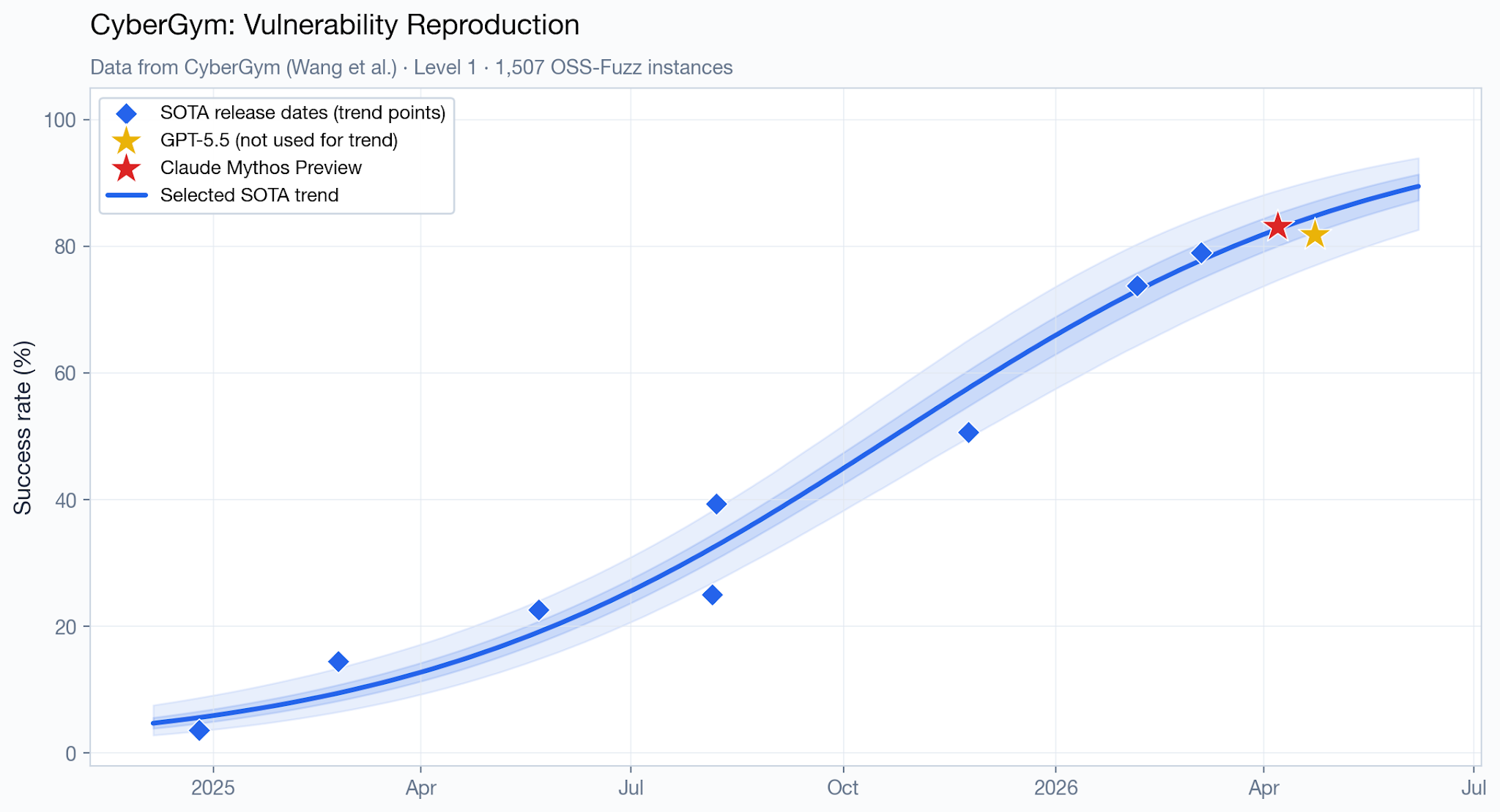
This shows the new models (Mythos and GPT5.5) as well within the thresholds of existing trends. Again bear in mind this is just showing performance on one benchmark, with relatively few datapoints. It's not immediately clear why a curve with that number of parameters was chosen, but you could probably fit a linear trend too.
Now here's another fucking monstrosity of a graph that I saw doing the rounds on social media:
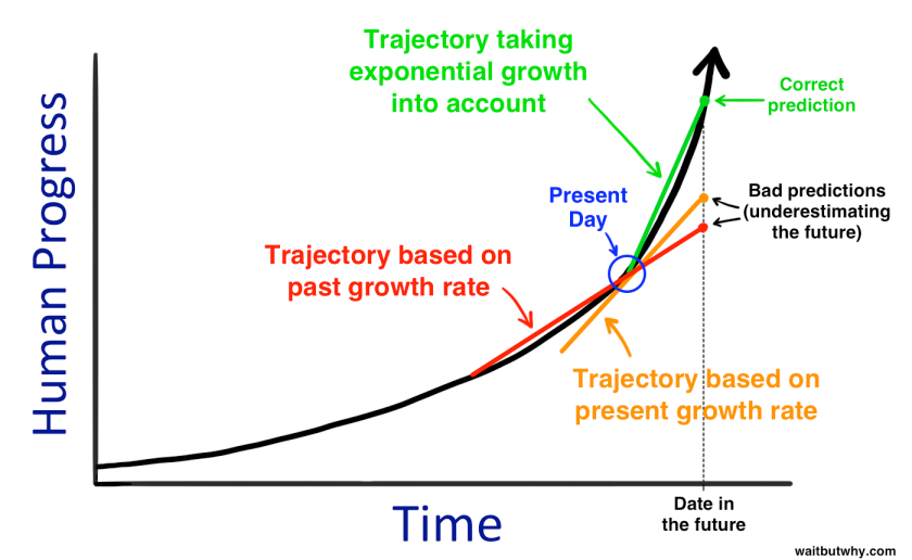
The original source can be found here:https://waitbutwhy.com/2015/01/artificial-intelligence-revolution-1.html, which to be fair, has a bit more of a nuanced explanation. Additionally it's from 2015 discussing potential future advances in AI
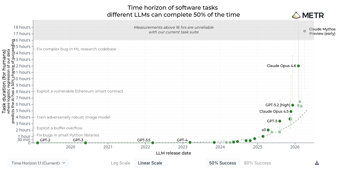
While this particular graph doesn't claim to show actual AI advances, and isn't based on any recent data, some people have been comparing this "prediction" with the now-famous Model Evaluation & Threat Research group (METR) report: Measuring AI Ability to Complete Long Taskshttps://metr.org/blog/2025-03-19-measuring-ai-ability-to-complete-long-tasks/ , which has been widely shared as showing exponential trend in capability for new AI models. There's a good analysis of this here MIT Technology Review: https://www.technologyreview.com/2026/02/05/1132254/this-is-the-most-misunderstood-graph-in-ai/.
Just a warning, this graph has been doing the rounds both in linear form (shown here) AND logarithmic form. It's good of the authors to provide both, but it's a bit confusing that there are now 2 different versions of the graph being circulated
When people share this graph, they're attempting to convey the following:
- Historic analysis suggests a linear improvement in model capability
- New models (Mythos / GPT5.5) break that trend
- The overall trend in model performance is exponential, and this is the start of that
This is flawed analysis for a number of reasons:
Lack of data
First off, this is a pretty sparse dataset to use for any sort of prediction. The graphs from METR have ~ 25 datapoints belonging to state of the art (SOTA) frontier models, not really enough for confident long term predictions, although all we have to work with for the time being.
Mis-representation of complex data
This graph is representing the performance of LLMs as a scalar variable: a single number that goes up or down. Obviously this is over-simplistic. You can measure models in a wide variety of different benchmarks. Our situation is even worse, since plenty of the people publishing benchmarks are motivated to fudge the numbers, and there is evidence the models are just learning the training / valuation data, leading to having to adjust and shift benchmarksDiscussed here: https://pointestimate.substack.com/p/how-good-is-mythos#footnote-3 . If you look on the Ollama model pages, every single model somehow comes up with a benchmark that shows themselves as the most performant model.
Lack of prediction of exponential trends
This is neatly shown in that chapter of "The Signal and the Noise", when it comes to extrapolating exponential trends. It is very hard to predict exponential trends without a real understanding of the system, as you simply do not know the exponent. And since the data is exponential, small errors compound massively. This graph shows possible predictions for spread of AIDs, based on 5 years of data, with 95% prediction band. In other words at any point on the X axis, given the observed trend, 95% of possible futures are between the error bands.In fact, scientists had miscalculated the exponent, and the true rate of infection was significantly higher
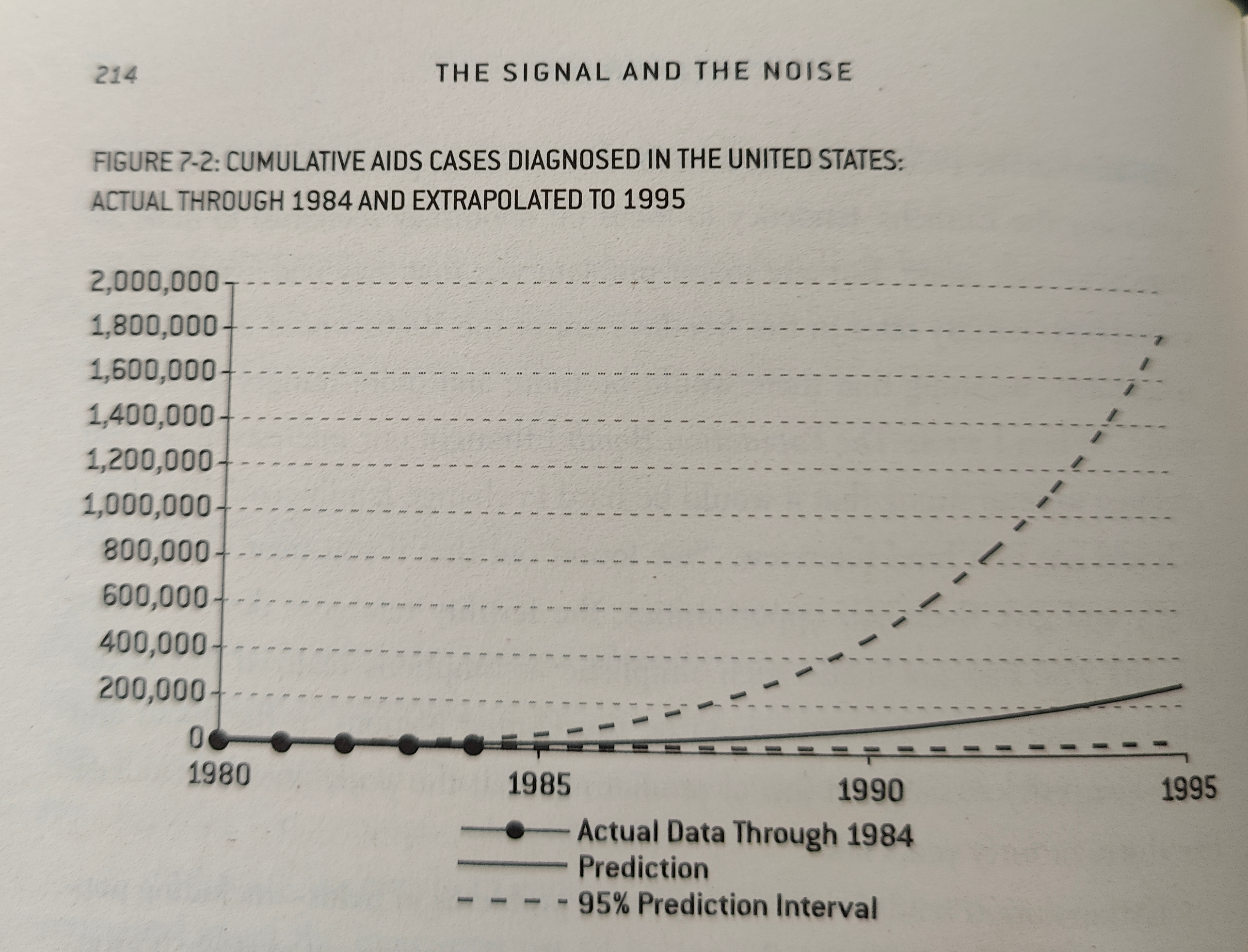
As you can see, there is an insane range of possible future outcomes and results based on this data. And this is when we know that the data obeys an exponential trend, as infectious diseases do, not when you are guessing the shape of the curve.
By contrast, the graph shown within the METR does not have 5 years of data and decades of study as communicable diseases have.
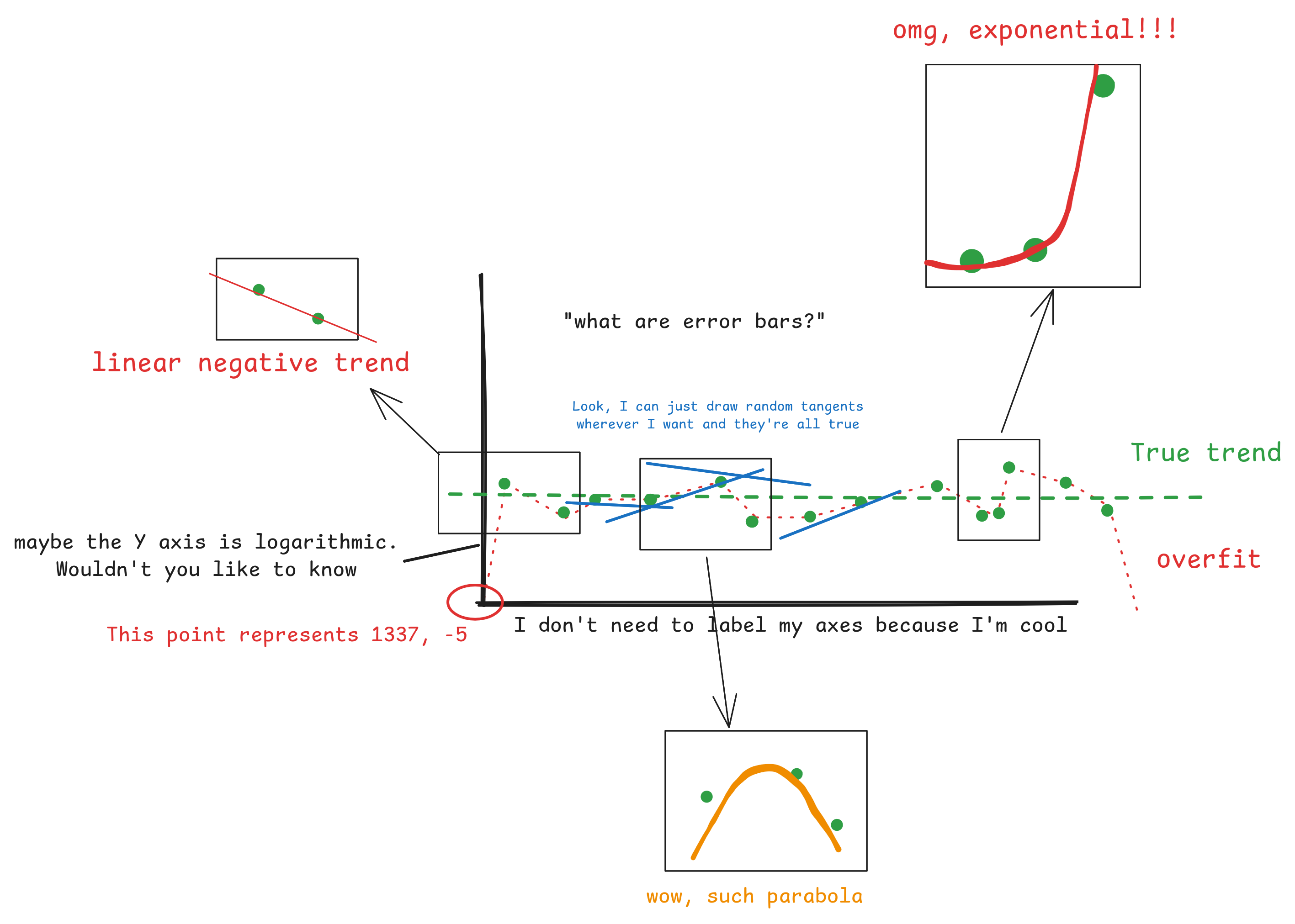
Now, we can't say that the increase in LLM capability won't be exponential, it might be. But you can't take a tiny number of studies, take 1 or 2 data points, plot arbitrary tangents and then confidently predict an exponential trend from that.
If you don't believe me, take a look at my awesome graph below, which magically can show almost any trend you want:
Anyway, this is not to dismiss the work of the various safety institutes. There is serious work being done, and the research and graphics aren't to blame. The issue is problematic mis-interpretation of the data, or over-willingness to read trends from the data.
</rant>
Summary
Okay, rant on misleading graphs aside, This was an enjoyable experiment. Things wot I learned:
- Geometric vs binomial distributions, and survival functions
- Difficulty inherent in modelling and predicting exponential trends
- Factors affecting ability to predict infectious diseases, from Chapter 7, The Signal and the Noise
If you want another good book on the subject I can recommend The Art of Uncertainty, by David Speigelhalter. It too covers the ability to predict things, and how we reason about unknowns.