Design
The squarish, block based design is supposed to imitate retro-futuristic computer interfaces such as Metal Gear Solid (V), Chaos Theory or Nier Automata:
MGSV UI
Splinter Cell UI
It uses hamilton as a base theme, using CSS from https://github.com/metakirby5/yorha to provide styling. There is no dark mode.
I'd read some blogs with neat sidenotes for links, upon researching how to do this I came across references to Edward Tufte. Projects such as tufte-jekyll provided the base for this site, as well as some some useful code snippets.
You can see a post highlighting the features and content styles here: Tufte style post, plus some custom jekyll plugins i wrote for scrollable + dropdown code blocks. Overall each post should make good use of images of different widths, plus sidenotes, resulting in something like this:
This actually got me reading Tufte's books on design, Visual Explanations, Envisioning Information, and The visual display of quantative information. These are beautifully produced, informative, and a joy to read.
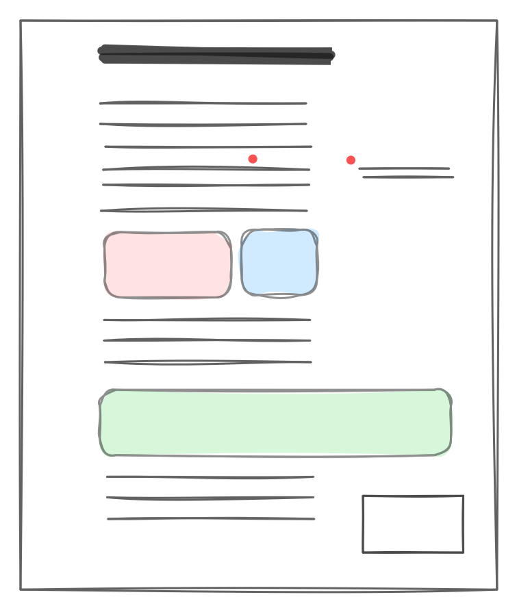
Although I'm not much of a designer I'm proud how this blog's design has ended up. I do my drawings in Excalidraw, which provides a really intuitive interface that can produce "hand-drawing-y" images. Over time, especially since LLMs have come about, I've been trying to incorporate more interactive elements such as embedded HTML diagrams and matplotlib charts, to make it feel less dry.
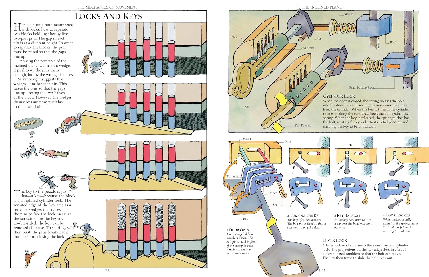
After quite a lot of time I realised that one of the inspirations for this blog, and my excalidraw-y diagramming style was this book I read as a kid: The way things work. It explains mechanical and scientific concepts with fun, engaging illustrations, and got me interested in science and technology. The illustrations in there are infitnitely better than mine, but I think I can trace back some of my wanting to understand and draw the shapes and interactions of systems to this. For example check out this amazing illustration of pin & tumbler locks:
The illustrations make frequent use of mammoths, a motif that hasn't made it over to my drawings, but I remember loving the inclusion of mammoths in that book, and the fun it added to diagrams. I found this good article about the books and their illustration that nicely summarises how the humour in the pictures helps readers:
The mammoth is us; a little bewildered but trying hard to make its way in a complex world. [...] Like the mammoth, the inventor seeks to humanise our attempts to understand technology and render it comprehensible; even if the answers gained are sometimes wrong. His descriptions are not always right, which on the surface could seem misleading. However, his story is always clearly indicated as a secondary and intentionally humorous tale
Similarly, I'd like to think my tails of failing to solve challenges, and frequent dead ends provide a more approachable narrative in learning how things work. There's another great quote from that article later on that discusses the method of communicating complex topics with illustrations:
The goal of such explanation isn’t to understand every aspect of a machine or technology, but to grasp its core ‘zeitgeist,’ its operating principle. The goal is not for people to be able to build a complex device, like a gearbox or telephone, but to understand how, in principle, these these things work. Crucially, its mean to encourage people to be curious and interested, to want to know more. They need to be comfortable with ever increasing levels of complexity.
I think this is also what makes me draw all the crappy excalidraw images, wanting to break down the systems to their component parts, and put them back together.
Depending on the platform you're reading from, you may notice the site doesn't render well on mobile. This is because I hat every second I spend on CSS / HTML, and I often hardcode widths etc as pixel counts in the source. Apologies.